
The city of Milan, long regarded as the global epicenter of industrial design and avant-garde architecture, continues to serve as a fertile ground for interior transformations that bridge the gap between historical preservation and contemporary aestheticism. In a recently completed residential project situated in the heart of the Lombardy capital, the local architecture firm Valencia Biscottini has unveiled a renovation that challenges the traditional sobriety of Milanese interiors. By utilizing a rare and striking original feature—a Rosso Francia marble floor—as the primary catalyst for the design, the firm has created a living space that evokes the perpetual optimism of springtime. Led by principals John William Valencia and Giuseppe Biscottini, the project stands as a testament to the power of chromatic storytelling and the meticulous curation of 20th-century design icons.

The Foundation of Heritage: Rosso Francia Marble
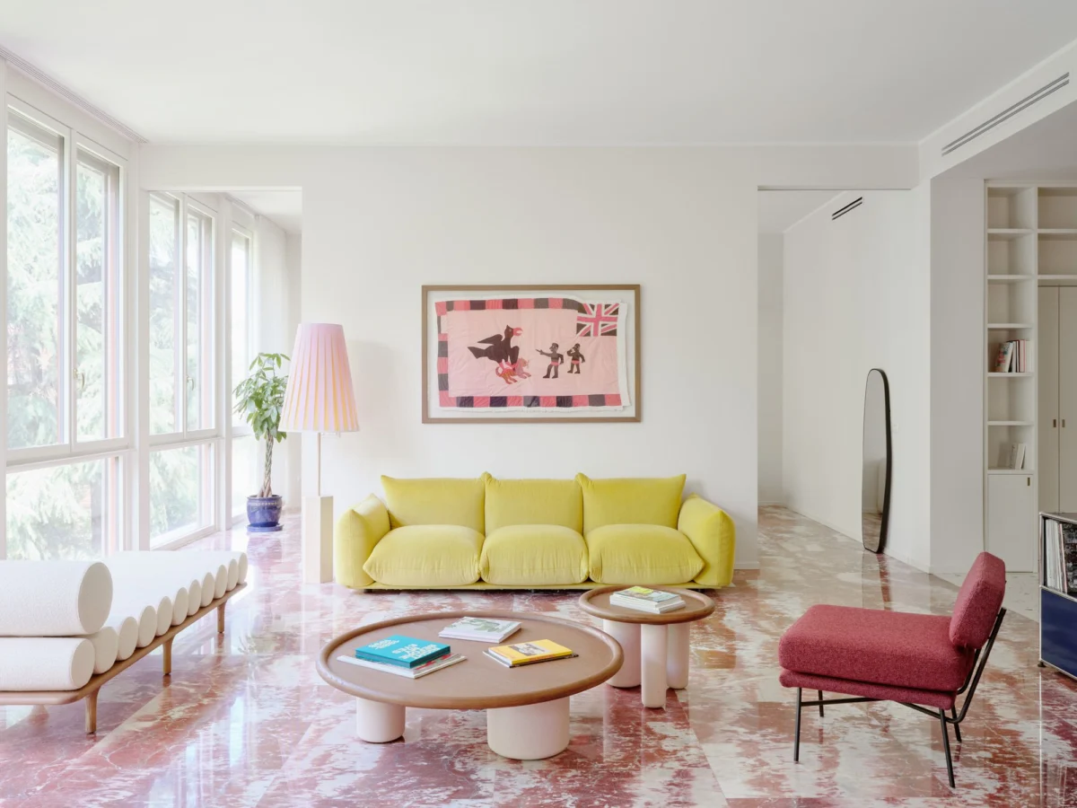
The genesis of the renovation was not found in a new material, but in a legacy one. The apartment’s original Rosso Francia marble floor, characterized by its deep, earthen reds and intricate white veining, served as the "chromatic compass" for the entire architectural intervention. Rosso Francia, a prestigious limestone-marble quarried primarily in the Languedoc region of France, has historically been used in monumental architecture, including the interiors of the Palace of Versailles and various European cathedrals. In the context of a Milanese apartment, its presence is a bold statement of mid-century luxury.

Rather than replacing or covering this historic element, Valencia Biscottini chose to preserve it, treating the stone as a living artifact. This decision dictated the subsequent selection of wall treatments, textiles, and complementary flooring. To extend this narrative into the more functional areas of the home, the firm collaborated with the renowned Fantini Mosaici to commission a custom terrazzo floor. This new installation artfully embeds fragments of the same Rosso Francia red within a more neutral, earthen-hued matrix, creating a visual bridge between the historic living areas and the modernized hallways and kitchen.

A Chromatic Narrative: The Psychology of "Spring"
The defining characteristic of the apartment is its unapologetic use of color. While many high-end renovations in Milan opt for a palette of "greige," charcoal, or stark white, Valencia Biscottini moved in the opposite direction. The objective, according to John William Valencia, was to "tone down the colors and bring them toward a dimension closer to the colors of spring." This resulted in a sophisticated layering of pastels that range from soft canary yellows to ethereal sky blues.

The entryway serves as the first chapter of this story. Beige walls were selected for their reactive properties; as natural light shifts throughout the day, the surfaces transition from a warm cream to a delicate blush pink. This "living" wall color is complemented by integrated bookshelves that conceal a hidden guest bathroom. In a moment of dramatic contrast, this small, private space features richer crimson accents, paying direct homage to the darkest tones found in the Rosso Francia marble. This intentional play with saturation ensures that the apartment feels dynamic rather than static, mirroring the shifting light of the Italian seasons.

Architectural Chronology and Spatial Fluidity
The renovation followed a strict chronology designed to maximize the apartment’s footprint while maintaining its historical soul. The process began with the restoration of the marble and the installation of the custom terrazzo, followed by the structural integration of wooden cabinetry in the kitchen and bedrooms.

- Preservation Phase: Professional restoration of the original Rosso Francia marble and the existing architectural moldings.
- Structural Intervention: Installation of the custom Fantini Mosaici terrazzo in transit zones and the introduction of Italian herringbone oak parquet in the private quarters.
- Millwork Integration: The creation of floor-to-ceiling wooden cabinetry to ground the airy color palette with natural textures.
- Curation Phase: The sourcing and placement of specific design icons that align with the "Easter egg" inspired color scheme.
- Biophilic Integration: The final landscaping of the terrace and the optimization of window treatments to blur the line between the interior and the outdoor greenery.
The transition from the public to the private areas is marked by a shift in materiality. As one moves into the bedrooms, the cold stone gives way to the warmth of oak. The herringbone pattern, a staple of classic European apartments, provides a sense of continuity and timelessness. These spaces are grounded by bespoke wooden cabinets that provide a tactile counterpoint to the soft, pastel-cloaked walls.

The Iconography of Furniture: A Curated Collection
The furniture selection within the apartment reads like a retrospective of Italian and international design excellence. Each piece was chosen not only for its functional value but for its ability to contribute to the overarching color story.

In the living room, the "Marenco" sofa by Mario Marenco for Arflex takes center stage. Its voluminous, cloud-like cushions provide a soft, inviting texture that balances the hard surfaces of the marble floor. Beside it, a pair of "Elettra" armchairs, designed by the legendary B.B.P.R. studio (Gian Luigi Banfi, Ludovico Belgiojoso, Enrico Peressutti, and Ernesto Nathan Rogers) for Arflex, offer a mid-century silhouette that remains strikingly modern. These pieces are accompanied by the "Pluto" coffee table by Studiopepe for Tacchini and the "Five to Nine" daybed, also by Studiopepe for Tacchini, which utilizes bolster cushions to create a rhythmic, sculptural presence.

The dining area continues this dialogue with a table and chairs from the Karakter collection, illuminated from above by the "Koinè" light fixture by Mandalaki Studio for Luceplan. The inclusion of an iconic modular console unit by USM Haller adds a touch of Swiss precision and industrial sleekness, proving that disparate design languages can coexist when unified by a coherent color palette.

Lighting and the "Color Drenching" Phenomenon
Lighting plays a pivotal role in how the apartment’s colors are perceived. Valencia Biscottini utilized a diverse array of fixtures from premier manufacturers including Oluce, Luceplan, Azucena, Servomuto, and Flos. Notable inclusions are the "LP6" wall sconces by Ignazio Gardella for Azucena and the "Berlin" ceiling lights by Christophe Pillet for Oluce, which hang in the hallway like luminous jewels.

Perhaps the most daring application of color occurs in the bathrooms, where the firm employed a technique known as "color drenching." By using Mutina’s "Pico" tiles—designed by Ronan and Erwan Bouroullec—the firm enveloped the bathrooms in monochromatic shades of pink and blue. This immersive approach creates a sense of sanctuary and playfulness, moving away from the utilitarian aesthetic typical of wet rooms. The fixtures, including pieces by Gio Ponti for Mamoli, ensure that even the most modern interventions remain tethered to the history of Italian design.

Broader Implications and Design Analysis
The Valencia Biscottini project reflects a broader shift in the global interior design market. As homeowners move away from the "minimalist fatigue" of the last decade, there is a growing appetite for "Maximalist Lite"—interiors that are rich in color, texture, and history but remain disciplined and sophisticated.

According to recent industry data from the Milan Furniture Fair (Salone del Mobile), there has been a 15% increase in the specification of "heritage materials" like terrazzo and colored marble in luxury residential renovations over the past three years. Furthermore, the trend of "biophilic color palettes"—those that draw directly from local flora and seasonal changes—is becoming a hallmark of sustainable and wellness-focused design.

The integration of the outdoor terrace in this Milanese apartment is a prime example of this trend. Giuseppe Biscottini noted that the greenery was "essential" and "became an integral part of the home’s color scheme." By using floor-to-ceiling windows to frame the outdoor foliage, the architects have allowed the natural greens of the city to serve as a backdrop for the interior’s sky blues and canary yellows.

Conclusion: A Delicate Balance
The renovation of this Milanese apartment by Valencia Biscottini is more than a simple aesthetic update; it is a masterclass in atmospheric engineering. By respecting the "bones" of the building—specifically the Rosso Francia floor—and layering a contemporary, optimistic palette over them, the firm has created a residence that feels both grounded in history and light as air.

In a world where urban living can often feel gray and disconnected from nature, this interior serves as a reminder that color is a powerful tool for emotional well-being. The apartment does not require "rose-colored glasses" to be viewed positively; its very structure and hue are designed to generate a sense of calm and joy. As the light changes over the Milanese skyline, the apartment breathes, shifting its tones and revealing its details slowly, much like the arrival of spring itself. This project reinforces Milan’s reputation as a city that does not just follow trends, but defines the very essence of living well through design.
